
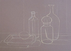
 Step One:
 A precise drawing or "skeleton" is the most important foundation of a good painting. Objects are in place, drawn in proportion, and arranged in a dynamic composition, relative to the space they are in. I usually use white NuPastel to execute the drawing because I depend, on layering the pastels for color mixing, and white does not interfere with the effects I want to produce. After doing a series of thumbnail sketches, this drawing or skeleton is done on my favorite Canson mi-teintes moonstone paper, a warm neutral. |
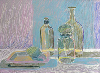 Step Two:
 The first layer of color I apply is one of local color and exaggerated color. Also, I always look for the lightest light and the darkest dark and establish those early on so I can evaluate my value range as I progress. I applied the pastel in loose strokes concentrating on building the mass of shapes. I used a complete set of my favorite hard NuPastels and a complete set of Holbein pastels. These provided a greater variety of colors and are only a little bit softer than NuPastels. |
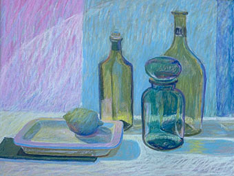 Step Three:
 I like the harder pastels for layering color because I build up thin strokes or layers to achieve the blend of colors I want. At this stage I built layers of color, paying attention to values and shapes. I began to use some outrageous color which, I usually either keep or knock down. Some of the outrageous color in the latter case will show through subsequent layers and enrich the color applied on top. I decided to enlongate the two taller bottles so they appeared more graceful and to add a spotlite effect on the upper left for eye movement. I also moved the right edge of the green background cloth over toward the left to echo the height of the bottles. In many cases, these things can be determined only after color is applied. |
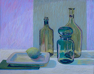 Step Four:
 At this stage, I began refining shapes, paying careful attention to transitions from light to shadow and to the effects of the light on transparent glass by observing and comparing color, value, and color temperature. I decided to keep the outrageous purple color I used in the white cloth. It is a direct complement to the blue-green colors in the objects, and it created a color bounce from the cool pinks in the edges of the rectanglular plate. I applied some black on the dark areas in the objects, and then applied dark colors to those areas. This helped emphasize the hard edges and reflective quality of glass. I continued adding color and refining value until I felt the painting was complete. |
Artshow.com
Copyright © 2002 Artshow.com. All rights reserved.
Web pages and artwork at this site may not be duplicated or redistributed in any form without express permission.